Showing posts with label Art . Function . Interior Design. Show all posts

From 2D to 3D to Fabrication


Why exactly should you bother with 3D design before fabricating a custom project?


There are many answers to this question, and since I'm currently working on a custom processional cross for Jon Buell of Buell Custom Design, I can quickly point out a few things.
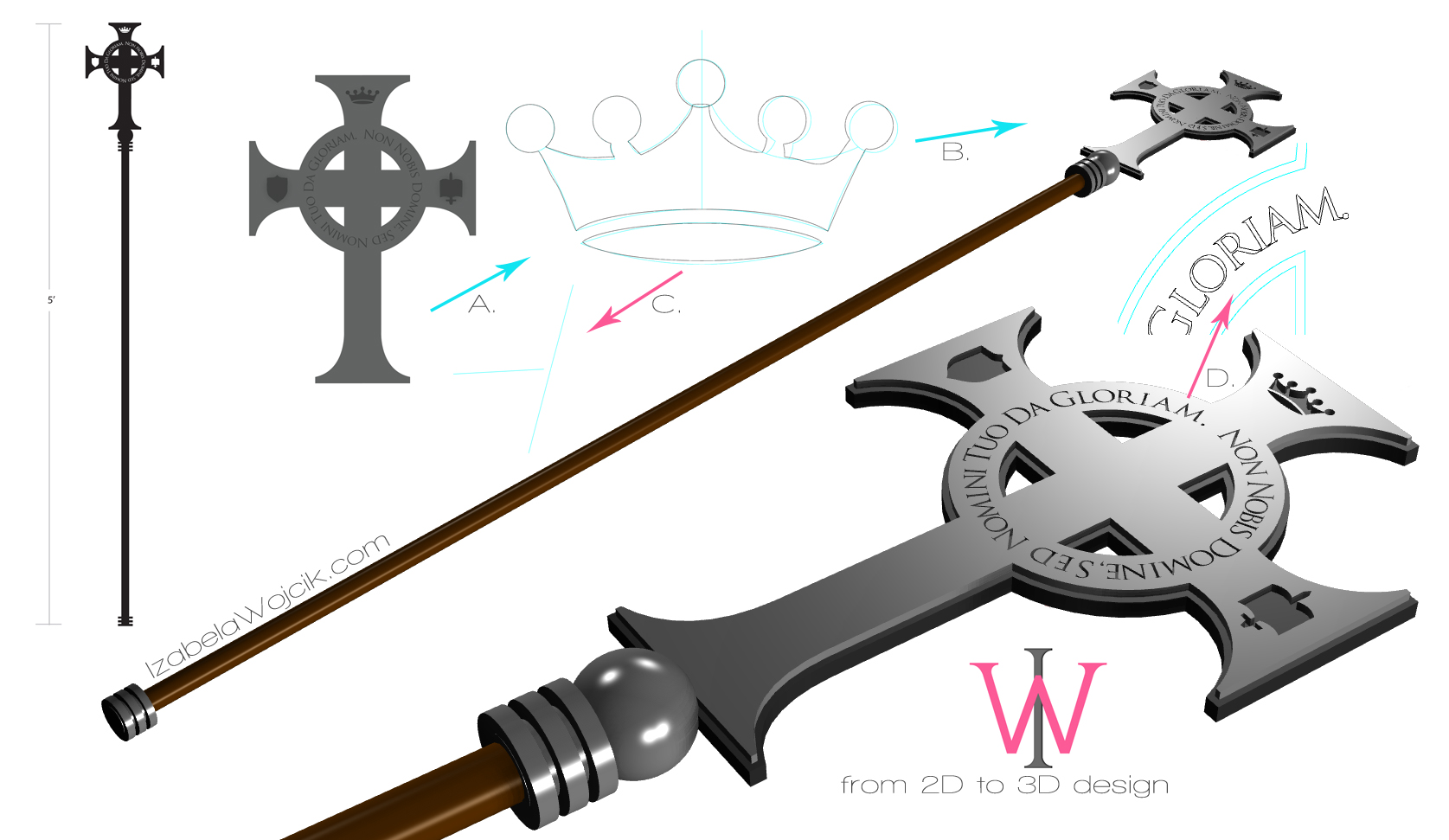
Usually I chat with a client, they tell me what they want and I put the design together, but Jon actually put together a beautiful cross design and sent it over to me. It looked fantastic! But as soon as I zoomed way in, the issues which needed to be addressed (and always do) popped up on my screen. Before I get into it, think of a great photo on your computer screen, but once you print it or try to enlarge it, all you see is pixilated image.  Well... sort of like that.
Take a look at the crown in the middle of the drawing. (click here for a larger picture) The black lines are a bit wavy (you don't notice that this happens, and it always does, unless you are working in a specialized program.) The blue lines are what I corrected and made sure that the piece is equally mirrored to both sides as well. Since this cross pieces will be initially be cut out of a metal plate by a laser or water jet cutter, the entire thing has to be programmed into the cutting machine. There are lots of people around town who do this sort of thing, but I like to work with Mike Boliver of Aquacut or Jason Brimberry of Ephesian Art; depending on what I need done. Both Mike and Jason work with an array of different programs, really work with you, and have a pretty quick turnaround time. Plus, they're absolutely lovable!
But... I'm derailing...
Another issue, and again, this happens frequently, is when two lines do not touch... like in the closeup of the blue lines. The laser or water jet cutter will run into all sorts of issues when this happens.
The third, and very important issue is that time is money! Each one of these lines has tiny little points on them. The laser is programmed to follow each line to each point. If you can get away with having one clean line, the laser will run smoothly over the entire area, and it takes less time... when the laser has to "think" about 40 points on the same line, you'll use up a whole lot of time. It's always better to clean up the images or simply start fresh and do this correctly in the first place. As you may have noticed, I did not re-design Jon's cross or the parts and pieces in it, I simply cleaned things up a bit and made them work for the machine. I also added the little step detail... if I'm going to cut two plates, I might as well use this extra detail in adding some texture to the piece. Take a look at the letters... I can tell that Jon used Illustrator to put the design together... but the problem with using this program is that once you make letters run across a circle, they will have spaces between them in some parts and, unfortunately, actually run together in other parts of the circle. I had to manually fix this problem and create spaces between each letter, or they would look a bit funny when cut out of a piece of plate.
Okay, so now that we had a little chat about line design and lasers, lets talk a bit about 3D design.
3 people can look at the cross in the upper left hand side of the drawing and imagine 3 very different ways of what the final piece will look like. This is precisely why I love designing the pieces in a 3D program, before they go into production. This way, all 3 of us will be looking at exactly what the final piece will look like, to the exact scale, with the exact dimensions, and the exact material sizes. After discussing the top drawing, we decided to handle this design in a different way. As you can see, the same design, an absolutely different cross! A little bit of work ahead of time saves a whole lot of time later on!


I can even give this cross a pretty good approximation of what the finishes will look like... that the wooden part will be oak, and the stain it will have, etc... but in this case, Jon and I already know what the finishes will look like, so the final 3D design has a more crude look to it.
At this point, I can ask Jon, "Do you like the front part of the cross being 1/8"? or would you prefer that to be a bit thinner?" It's so easy to make those decisions now, so that there are no regrets later on in the process. Changing little things in the world of custom while the piece is fabricated might not be a big deal some of the time, but other times it will hurt your pocket... preventing this is a good idea in my book!
After the two pieces return from the cutter, my guys will go to work on this cross and put the entire thing together. By doing all this ahead of time, I'm saving their time as well, and all of this translates to the piece being done correctly, as expected, and quicker than it would otherwise have. And this, of course, translates to saving time and money!
I don't need to go through these steps for every project, of course, but this one absolutely lends itself to it.
I'll be sure to thrown in a photo of the cross when it's done... you'll love it once it has all the hand worked nuances like the patina and so on worked in.

The worlds of art, design, and architecture are colliding! 3D Art Night: Digitizing Reality


3D printed figurine of an actual human, by Captured Creations.
Last night I went to Captured Dimensions, a 3D scanning and 3D printing studio in Plano, TX, where a whole lot of 3D artists, computer game designers, as well as traditional sculptors got together to participate in a talk given by artist Bridgette Mongeon.  So what do all these people have in common?

Let me start at the beginning...

Michele Azzaro, who works for the company, has been telling me about this 3D technology her company has been working on for a while now, and it all sounded great, but you know how pictures speak louder than a thousand words? Well, they do!  I got an invitation from Michele, via Facebook, and the invitation had a link to a video attached to it.  I clicked on the link  and was absolutely blown away!  You have to see this... the possibilities are endless... but to start with, think of little wedding cake figurines which happen to be exact replicas of the actual couple who are having the wedding.  Imagine this: Captured Dimensions snaps a single photo of you at the same time, 81 times, from every single angle you can imagine, transports it into their 3D environment, and prints you, exactly as you are in that place in time!  Fabulous!  I just couldn't wait to see more!


On the night of the event, I was pretty much knew what to expect, but was further blown away by the capabilities.  They can actually take a hand-held scanner and visit your home to scan a sculpture you have in your backyard and print little replicas of it, or a full scale replica, or even a larger one!  They materials they can print in are also many, not only plastics, but ceramics, etc... 

Now imagine manipulating your own images in 3D, basically sculpting in a virtual reality, and printing your sculpture into the real world.  Technology and art are starting to merge together for sure... and now your'e starting to get the picture of why Bridgette, an artist who sculpts people and animals, was there...


Brigette Mongeon is an artist, sculptor, writer, educator, public speaker, a wife, a mom, and a grandmother!  Due to an injury she sustained to her hand, she was no longer able to sculpt, and since sculpture is her life, her husband suggested virtual reality.  Her injuries healed eventually, but by then she was hooked!  She is currently using the 3D world to explore her ideas, to show her clients what their commissions will look like before they are brought into the physical world, and she also uses the 3D printing and CNC/ROBOTIC technology to print the base of the sculptures she created so that she can sculpt on top of that and make the sculptures her own.  Imagine the time being saved by not having to weld rebar and apply tons of stuff on top of it to come up with the skeleton of the piece.  (by the way, I can't wait for her new book to come out next year... lots and lots of great 3D and sculpture tips and secrets in that one!... I got a preview and the preview was fantastic, you should really check it out)


All of this is very exciting for the world of art, and I will most definitely keep this in mind for my next large scale sculpture project... I know that I most definitely could have used this technology for this tortoise I sculpted, which was cast in bronze, but it's also exciting for the world of home building and interior design as well.  Check out this video of circular staircase stringers being milled out out wood!  Unlike having to build this on-site, which takes a whole lot of men power, not to mention the oopsies, this bad boy produces extremely precise life size replicas of the design created in the wold of 3D.

Since I am an ornamental ironwork and lighting designer, I absolutely love to use 3D technology to show my clients what their final projects will look like.  I've been doing this for just about 10 years; I know exactly how hard it is for clients to picture certain designs from a drawing on a piece of paper.  With 3D technology, nothing is off the table, depending on how far you're wiling to take it, you can pretty much accomplish anything.  Take, for instance, the photo below.  It's a quatrefoil gate design I put together on one of my 3D programs; wouldn't you say that it looks pretty real? ...all the way down to the finish.  I created it in real-world dimensions, so everything is exactly as it will be in our real world.  At this point I can superimpose this gate into a photograph of the stone columns it will actually fit in-between, and the client will see exactly what they will be seeing when the actual gate would be installed.  I put this particular design together for the purpose of hand forging, but since I have the file, I can now print little replicas, or actually CNC this design out of a single piece of metal.  I mean, how amazing is this?


Anyway, I could keep going and going, but this post would become extremely long... I hope that this has sparked your imagination and you'll look a bit further into the technology.  I know that I have a whole lot of ideas floating around in my head, like 3D printed chandeliers like this one, which I also designed recently for the purpose of forging in wrought iron:


If you have any questions or great ideas, please comment below.  I'm posting a few pics from last night below... Chat with you soon!  Izabela

So, what am I holding in my hand? A tiny 3D family portrait, of course!
If you don't know Breanna Cooke, you should!  It's such a small world!  I was just admiring the costume she she made for herself a few months ago, I walk into Captured Dimensions and what do I see?  A little replica of Breanna in her costume!
Brigette and I, Norman Rockwell style!

Inside the Photo Booth!

Imagine! All these cameras and you're 3D!
...and a whole lot of comic con characters just love to go digital!
Okay, one more fun thing before I go... if you have a $100 burning in your pocket and you want a really awesome business card, get a hold of Michele or Jordan at Captured Dimesions... I saw theirs yesterday and was absolutely in love!

In the first photo, I'm holding their card against the background of one of my paintings, and I took a picture of that.  In the second and third photos, I scanned the card with the app on my phone, and a 3D image appeared on top of the card, which I could actually view from all sides, based on how I moved the card.  I took screenshots of what was there... isn't it fantastic?


to do this, you'll have to download this free app called Augment to your phone or iPad... just go to your apple store or what not and type in Augment.

scan this image with your phone or ipad (you can print the image or scan it from your computer screen) and there you have it... move the phone back and forth and the image will magically rotate... it literally sits on your business card.
Have fun!

Oh Goodie! The Rockitecture photo is here!


Greg Brown, the program director at the Dallas Center for Architecture, sent me a photo from Rockitecture! I did not attend this year, but I did donate one of my paintings for the auction... it's the one on the right:)
Thanks Greg!

Second Time Around: The Hubcap as Art


Several years ago I got an invitation from Ken Marquis, the founder of Landfillart Project to participate in an international effort encompassing one-thousand-forty-one (1,041) artists to claim a piece of rusted metal garbage and create fine art. The pieces of trash were made up of old automobile hub caps from the 1930's through the 1970's and mine arrived in a large box just a few days after our initial conversation. It was an old chrome Chevrolet piece, rusted in places and most definitely mistreated by the time it had spent in the landfills; using it as a canvas was not an option for me; this piece was begging to reveal the beauty hidden beneath the patina of time. I decided to strip the piece to its core, finding the gold underneath the silver; jackpot! The freshly unearthed metal looked as if the piece had been molded just that day... I decided to distress the piece and apply a dark patina to the surface, lightly taking off the high areas, and slowly, but surely, creating art. I loved it so much that I really didn't want to send it back. After a few days of enjoying the piece at my home, it was finally time to pack it up and ship it back to Landfillart.org, where it could do some good for our precious earth.

Today I have been informed that a bunch of the pieces were chosen to be displayed at the MSV in Virginia!  Here are a few other pieces which will be on display:


ABOUT THE MSV EXHIBITION

The exhibition of environmentally inspired contemporary art, Second Time Around: The Hubcap as Art will present the works of 287 artists from every US state and 35 other countries from Sunday, September 7, 2014 and run through March 1, 2015.

In support of the opening of Second Time Around, the MSV will concurrently present WASTE NOT, a version of the exhibition Green Revolution which is made available by the Smithsonian Institution Traveling Exhibition Service based on an exhibition originally created by the Museum of Science and Industry, Chicago, and its Black Creativity Council.

To top the cake with a cherry, my piece is being displayed on the front page of Landfillart.org; how fun is that!

Wrought Iron Branch Gate

My latest design is a wrought iron branch gate with a few lonely leaves, still hanging on, and a little bitty bird sitting on one of the branches.

I think that wrought iron doesn't only have to be traditional, it's beautiful in the hands of an artist, who can tell stories in the material.  I also absolutely love the organic look which can be achieved in the hand forging of the metal.

visit me at IzabelaWojcik.com

The Art of Venetian Plaster


I have always been fascinated by Venetian plaster, and those who love the look, consider the finish ultimate in elegance. The richness of the lustrous colors in Venetian plaster truly make the room.  Used in Italy for hundreds of years, the plaster was used to repair or even replace damaged marble.  On top of the fact that it is durable, this classic finish, made up of marble dust, lime and pigments, actually feels amazing to the touch.

There are lots of great things about this plaster, like the fact that it can be smoothed out to feel like glass, but the most fascinating thing about it in my opinion, is that for some reason those of us who might go with a more subtle pallet of paint choices for our home really can go wild with Venetian plaster and it always looks spectacular!

In theory, the finish should be an easy task, but I have experimented with it for a project at my home, and let me tell you... not as easy as one might think.  It takes an artist to truly bring the Venetian plaster to life.  Tom Soltys, with whom I always seem to cross paths, is one of those rare people who can make any crazy color look out of this world, even black!  He was showing me the other day a finish he did for on of his clients, and I was just blown away.  The black Venetian plaster, contrasting the white travertine floors... I automatically pictured classic contemporary furniture, wall accessories and lighting, which would further contrast the finish.


Here's one home we crossed paths on... it was an amazing project by the talented team of Carl Wesley Lowery and Cody Wayne Glover from Wesley-Wayne Interiors.  If you are looking for an interior designer, they should be in on your list of potential interviews.  I asked Tom if I could use his photos for my blog, and he agreed, so of course I asked him if he would like it if I'd add his phone number... "Of course," he said.  So, here it is: 214.677.6254.  I think that everyone, home owner or interior designer, should get to know Tom for sure.


From coffee tables to Gothic chandeliers: my new wrought iron designs

I've not been blogging for quite some time, so I decided to show off a few of my recent designs....
It's a mix of custom light fixtures, coffee tables, and exterior gates.  Some are wrought iron, some are more modern and nickel plated, and all of them can be made for your home, in a custom size, a finish you desire, and what ever the configuration your home requires.  Let me know what your favorites are, and click HERE to get a hold of me.  Here we go...

This is one of my favorites, a hanging branch fixture... some might consider it a hanging branch sconce, and others a hanging branch chandelier... what ever works for you.  It's the perfect piece for a transitional or contemporary home.  A great finish for this fabulous fixture would be a brushed nickel or a polished chrome, but it can also fit in a more traditional home as well, with a gold or silver or even a natural wrought iron look.


Going toward a more traditional design, this four candle chandelier is a great piece for anyone with a smaller dining room table.  It provides plenty of WOW factor, without taking up the space of a larger, more traditional designs.  The scrolls are beautifully textured, and I think that this finish is just perfect for the design.


A simple candelabra goes a long way... In this case it will be all about the textures and finishes.... Maybe a mix of dark pewter with a touch of antiqued copper or brass.


The large quatrefoil design is just the thing for this simple, yet effective red coffee table design.  The vibe of this piece changes entirely by changing the finish to a soft nickel plating or even a warm black finish.


For those of you with large homes and a whole lot of ceiling space, a three tier gothic chandelier is just the thing.  The entire fixture is spectacular, but the bottom tier is where the magic really happens.  I've alternated lights with gorgeous, hand forged floral details.


Quatrefoils are, in my opinion, one of the most gorgeous designs ever made by the old masters.  I just can't get enough of them.  Here is a gate design, which incorporates two types of quatrefoils, which makes for a very impressive piece of functional art.


A New Designs Page For Interior Designers and Clients

The big day has come!
I'm happy to unveil a page I've attached to my website, which consists of my new paintings, lighting, and other ornamental metalwork designs.

Just as I had pictured, the page is all about Art & Function.

Here's the thing... I absolutely love doing it all, and couldn't decide on just one, because that would me not being me.  I love to paint, I love to sculpt, and I also love designing ornamental ironwork and lighting.  I simply adore working with designers, architects, and home builders, as well as the art types.  I do not see these things as separates; I see them as a whole, which makes me who I am and also, kind of makes my life interesting.

In any case, I think it's the perfect place to show off my designs as well as give designers new ideas for their client's homes.  The most wonderful thing about it?  It's all custom, so I can make any of these pieces in any size, finish, configuration, etc... I can re-design anything to fit the client's home, or just come up with a brand new design.  After all, custom is what I've been doing for over 10 years, the only difference is that now I can do it on my own terms.

Click HERE to check it out, and let me know how you like it.

Hugs!
Izabela

Interior Designers say Gold is back


I just read that gold is back!  Not only in Sochi, but in the glimmer of the eyes of interior designers everywhere.  Silver tones have been our friends for a long time, but now little gold accents are appearing in beautifully designed homes and I'm loving it!  I pulled the photo above from Houzz; the gold accents most definitely pop in this zen-like space.

According to Tracy Hobson Lehmann "In a scene long dominated by the silver tones of stainless steel, nickel and chrome, consumers are warming to gold."  I have to agree that clean lined mid-century pieces work quite well in this warm metal, no longer the polished brass of the eighties; thank heavens.
Just keep it toned down; after all, a little does go a long way.

Brought you a lollypop. FEELING BETTER?


This is what happens when you are having entirely too much fun making a graphic... suddenly it's 2am and you don't know how it got there.  Anyhoooo... I have been seeing all these photos of the most adorable owls on Facebook lately, so I thought of making a feel better greening card.  I suppose it could be an owl t-shirt or what ever else just as well.  Don't you just love the pink crochet hat? In any case... it was a blast.  Now that I have the base, I will work on making it look just like I want it to look like... this one is just a quickie.


The Ten Best Interior Design Bloggers

Looking  for blogs dedicated to fresh finds, inspiring ideas, and  a hearty supply of interior design from all over the world? 

Here are the top ten  best interior design bloggers, according to White Horse Digital's Ruth Hoskins. 


1. Abigail Ahern

abigail ahernInterior designer and retailer Abigail Ahern has had heaps of praise bestowed on her; “the woman rocking the world of interiors” and “style spotter extraordinaire’”by The Times. Abigail owns one of the coolest interior design shops in the UK – Atelier Abigail Ahern. She is also the author of A Girl’s Guide to Decorating and has an A-list celebrity clientele, from Robbie Williams to Robert Downey Junior. Abigail’s style is ultra-luxe and fuses vintage with contemporary in an oh-so glamorous way. Her blog does not disappoint, she shares daily insights including recipes, style tips, cool product finds and trade.
We love: Abigail’s blog really does give an authentic insight into the creative mind of a leading designer. Plus the photography is lush – sultry, opulent and seriously lustworthy.

apartment therapy2. Apartment Therapy

The Guardian says; “ordinary readers showing off their extraordinary homes…it’s hard not to become addicted.” This blog/forum is huge, with fresh content posted literally all the time. Somehow it still manages to feel like a community. The main part of the blog is the House Tours, giving an inside peek into hipsters’ homes around the world – truly lust-inspiring and indulges in our voyeuristic dreams. It’s super visual with fun, snack size videos like this one – One minute tip: How to carve a turkey .
We love: The utterly intuitive navigation that invites you to dip in to daily tips and explore the content.

3. decor8

Founded by American award-winning and best selling author and journalist Holly Becker – a serious influencer in the blogging community. decor8 interior bloggersdecor8 is a blog dedicated to ‘fresh finds, inspiring interiors & ideas for creative living’ and is beautifully designed. The site gets over one million page views per month, 60,000 followers on on Twitter,182,000 followers on Pinterest, 63,000 followers on Facebook and 28,000 following her on Instagram.
We love: The very personal way in which Holly writes makes this site read like a novel – it’s a great example of storytelling.

4. Bright Bazaar

Bright BazaarWill Taylor is a self-proclaimed ‘lover of hues’ and his vibrant blog is a breath of fresh air and pays homage to his colour fascinations. A well-known home interiors journalist, ex-Habitat visual merchandiser and blogger since 2009, Bright Bazaar has an incredibly loyal following. His daily posts are as fun as his bright coloured images. His colour cocktails are cute moodboards packed with product suggestions.
We love:  The ten things I learned this weekend category – where Will documents all the things that have inspired him , from out and about photographs, to product picks and inviting Cafes and shops. This is much more than an interiors blog.

5. Bodie & Fou

Perfect Sunday morning iPad fodder, the Bodie & Fou blog is attached to the award-winning online concept store. It was voted in the Top bodie & feu20 Interiors blogs by Vogue magazine (UK) and is just gorgeous. Started by Karine Candice and her sister, the French pair write about their inspiration, creative interior tips and create luxurious and want-to-buy-now visual guides to their favourite products.
We love: Boudie + Fou’s blog has some of the most beautiful photographs we have seen, curated perfectly to complement the tone of the blog and store.

6. Habitually Chic

Habitually Chic blogHeather Clawson is a decorator, author and photographer based in New York City. Her blog is unashamedly glamorous and gives a glimpse into an Uptown Manhattan life that Gossip Girlmade us all want to be part of. Her posts are visually inspiring and artfully put together. This recent post Bergdorf Goodman Holiday’s on Ice gives us an insider scoop on what’s happening in NYC right now.
We love: Even though her style is uber-glam, Heather’s style is effortlessly easy-going. No haughty tone here, just the feeling that she is bringing us into her high-shine world.

7. Design*Sponge

Design*Sponge is a legendary design blog run by Brooklyn-based writer, Grace Bonney. Launched way back in August 2004, the site updates between 6-8 Design*Spongetimes per day and was declared a “Martha Stewart Living for the Millennials” by the New York Times. We have long followed this lifestyle blog that serves up a hearty supply of design, craft, product and recipe ideas – creating the ultimate style bible. Their following is pretty awesome too. Design*Sponge currently has 75,000 daily readers on the main site, over 127,000+ RSS readers, 405,000+ Twitter followers and 70,000+Facebook followers.
We love: Easy to navigate and pick out the latest content, we love the design of this blog. It goes against the standard white minimalist look, and is instantly recognisable by it’s fun design.

The Selby8. The Selby

..is in your place. Tom Selby is a photographer, director, author and illustrator. The Selby offers an inside view of Tom’s creative, and often well-known friends in their personal spaces. The site quickly grew to daily visitors of over 100,000 a day and spun into campaigns and collaborations with Louis Vuitton, American Express, FENDI and more.
We love: Tom’s portraits not only show off a little black book of friends to die for, but are set in super hipster locations around the world – if this was reality Tv, we would watch it all day long.

9. Lobster and Swan

Lobster & Swan blogSussex-coast living Jeska’s blog Lobster & Swan is a vision of heaven to vintage-lovers. Whimsical and inspired by ancient Britain, bunting and tea parties, the content is varied and creative but always beautiful. Her ever-changing vintage-style home features heavily. She posts her thrift shop finds, home made craft projects (also available through her Etsy store) and more. A great read on a rainy day that can take her readers into a world of sunshine and colour.
We love: The patterns, textures and images create a real vision of a vintage lovers paradise.

10. Door Sixteen

A cute blog from Brooklyn & The Hudson Valley, Door Sixteen is a personal tale of renovating a Victorian House in New York Stats. It’s an Door Sixteen bloginviting story, as Anna shares the small details of her daily life, but makes them sound really interesting – she posts her weekend to-do lists, and music videos she has unearthed. All of this combines with beautiful imagery to create a real-life and extremely readable journal.
We love:  The daily detail of Anna’s life is pretty addictive.
If you are interested in reading more – our articles ‘11 Things Brands Can Learn From Bloggers‘ and ‘The White Horse Blogger Outreach Guide
  by 

Eco Friendly Homes amongst the Trees

Such a simple idea, yet it blows your mind.  Can you imagine if everyone could live amongst nature, but left no environmental footprint?  Well, that's what Konrad Wójcik pictures the world, and I love it!
Below is an article I spotted online... I think you'll love it.


Danish architecture student and interior designer Konrad Wójcik has devised a concept for a prefabricated tree house that would leave no environmental footprint.

The project, dubbed Primeval Symbiosis (Single Pole House), was designed as part of the d3 Natural Systems 2013 international architectural design competition, which asked designers to create innovative sustainable proposals that study intrinsic environmental geometries, behaviours, and flows.

The home’s designer was inspired after studying the functionality and
“For most animals, trees are the best natural shelters against predators, moisture and weather. Studying its nature allowed me to come up with ideas and solutions to create a completely self-sufficient construction,” he said.

The house can adapt to almost any existing landscape without leaving any footprint.
The name Primeval Symbiosis refers to the connection between the house and its natural environment.
At present, traditional housing developments and urban sprawl necessitate massive deforestation around cities and urban areas. While some recent projects are making partial efforts to reduce deforestation, Wójcik’s idea proposes to eliminate deforestation by creating houses that can adapt to the existing landscape without leaving any footprint at all.

The name Primeval Symbiosis refers to the connection between the house and the natural environment.
The pyramid-shaped building is 16.64 metres high and features only 61 square metres of floor space spread over four levels. The entrance is through an automatic folding metal ladder that connects the ground level to the first level, which is five metres up above the ground.
Levels are divided according to their functions; the bottom floor is the entry level and features access to the house, a mudroom, a storage area and a technical area. Level 1 is the ‘day level’ where the kitchen, living/dining area and the bathroom are located; level 2 is the mezzanine ‘work level’ featuring a desk and a storage area; and level 3 is the ‘night level’ or sleeping area.

Inside the house, alternating tread wooden stairs helps to save space and ensure the interior areas step around the ‘technical core’ of the dwelling, which is like the trunk of a tree, offering structural support.
The structure itself consists of a light wooden frame built around the central pole, and the exterior walls/roof are covered in black Zink, a 100 per cent recyclable material that is highly resistant to weather extreme conditions. Windows are triple glazed to meet the standards required for passive heating and cooling, helping to make the house energy efficient.
Cross Sections.
Cross Sections. (Click on the image for a larger view)
The house’s exterior includes 40 square metres of solar panels  and the house was designed with a 25 degrees slope to maximise its efficiency. The façade also features a natural ventilation system, while below the entry level, a rain water storage tank holds enough water to meet the needs of the house’s occupants.
The Primeval Symbiosis model aims to remind people that nature is wise and that trees serve a purpose, while deforestation hinders the world from an environmental standpoint. The ultimate goal behind this idea is to create a community of these homes that can be located in any natural landscape, nullifying the need for massive deforestation and leaving zero carbon footprint.

by: Mercedes Martty


A Designer Who Renovates The Minds Of Her Billionaire Clients

After you meet this designer, you'll know the history of just about everything in your home.  I thought you might like this article from Forbes India.


Joan Behnke redesigns the homes of the rich and famous by first renovating their minds.

When interior designer Joan Behnke brought Bob and Audrey Byers to Paris, one of their first stops was the Grand Palais. The petite, silver-haired Californian marched her new clients, self-made health care multimillionaires, through the great hall’s Monet exhibition, using the painter’s work to engage the couple in a larger discussion about fine art. “You have to bring clients along on a journey,” explains Behnke, a soft-spoken 59-year-old. “It’s about teaching people to appreciate what they are paying for.” 

Behnke’s work adorns the homes of some of the planet’s wealthiest people. Her clients pay for six-figure furniture by haute designer Hervé Van der Straeten, weathered antiques pulled from the rickety tables of the Paris Flea Market, rare strains of Carrara marble selected along the steep edges of a Tuscan stone quarry, black lacquered chairs created by artisans in a remote fishing village in Myanmar. More than anything, though, they pay for the stories that come along with these items.

Every fixture, every finish, every decoration positioned inside a Behnke-detailed home comes with an adventure attached. The designer insists that her clients personally play a role in the narrative, whether as an integral part of the sourcing or as a Behnke-educated font of information on what is in their homes. And every step of the journey, from igniting an appreciation for fine art to enabling a client to choose her own bespoke light fixtures at a glassmaker’s studio, contributes to the Behnke brand. It’s an investigative process that may span years and cost anywhere from hundreds of thousands to tens of millions of dollars.

On a recent day we visited the Byers’s newly finished 23,000-square-foot Richard Landry-designed château overlooking Lake Sherwood in tony Thousand Oaks, California. 

“I don’t want my clients to just own a personalised piece for the home; I want them to experience it,” Behnke stresses, as we stroll through the mansion. Bob Byers eagerly joins the tour, pointing out a restored antique chandelier found at a Paris street market, reclaimed bricks from Boston’s Big Dig that march along the domed stairwell ceiling, a silky handwoven fabric from Laos that wallpapers the powder room and sliced bottle bottoms that form a gleaming glass collage on the wall of the wine room. The pièce de résistance: The lush black-and-gold home theatre with a glass-panelled strip embedded in the floor to reveal an exotic-car collection in the showroom below.

Behnke’s network of high-net-worth clients—or, perhaps more aptly, collaborators—love her for putting them through their paces. “She always makes you feel like you are the contributor, that you are manifesting your own mission,” attests Thomas Barrack, the billionaire founder of Colony Capital and a decade-long client.

Despite a college degree that included art history, Behnke first pursued a career in modern dance and put in time working on films.  Eventually, she scored a job with design maven Erika Brunson. Her first project: Helping design the Saudi royal family’s estates in Riyadh and other locales. The gig exposed her to high-luxury vendors and specialised sources across the world, stoking a passion for uncovering unusual items and, once she began her own firm in 1999, a desire to spread that passion to her clients.

“I don’t view her as a decorator; she is a cultural scientist,” says Barrack. “She will research little, narrow, unknown tunnels of history on a particular project and then start drilling down. She doesn’t just do research of the period; she has contacts all over the world who help her manoeuver through identifying objects and materials.”

by Morgan Brennan

How to make your rented home special

We all know how hard it is to personalize a rented home, or is it?
Read this article and you'll be amazed how easy this actually can be.


Washington - Three years ago, newlywed Kerra Michele Huerta packed her wedding dress and her two dogs and drove to Washington DC to join her husband in a one-bedroom rented flat.

The designer had no clients and no design network in the American capital. Her budget for decorating her own flat was small. But she threw herself into space planning, flea market shopping, furniture repurposing, organizing and DIY projects, creating a personal, warm place.

Friends were amazed (and, yes, envious) at what she’d done: lined a stairway with several dozen framed photos, maps and artworks; painted the kitchen in black chalkboard paint; turned a walk-in cupboard into a dressing room. Soon she was giving out advice.

Eventually, she needed a bigger outlet for her creative energy and launched a blog, Apartment Envy, to chronicle her frustrations and successes in trying to personalize a soulless urban rental space.

“I figured that lots of people in their 20s and 30s are renting rather than buying. They need budget-minded advice,” Huerta says. “They want their place to look good now. But they also want to be able to take the stuff with them and use it wherever they go.”

Huerta, 30, says being a longtime renter has forced her to be creative and has led her to discover lots of design sources. Her online community chimes in with more ideas, as well as yeas and nays on color choices and furniture placement.

Today, she and husband David Reidmiller, a climate scientist, live in a 52m2 one-bedroom rented flat with a king-size bed and a homely refrigerator camouflaged under a layer of cool patterned contact paper.

Huerta has filled her home with finds from the internet, flea markets and and a bit of dumpster-diving. She hunts for used furniture on online sites for second-hand stuff.

From the reaction, it was clear that Huerta’s ideas are useful for almost anyone looking to create a happy space on a budget. Here are some of them.

1. Dump the mini-blinds. Nothing says temporary rental like clacking blinds. Huerta removed them and put them away in a cupboard. Most flats and townhouses have standard size windows, so it’s easy to find ready-made fabric or woven shades, or even curtains. If you can’t use them in your next home, you can often sell them to the next tenant because they probably don’t want those mini-blinds, either.

2. Add depth to a narrow galley kitchen. Remove cabinet doors to create a custom look and add personality. Not only will it make your kitchen feel larger, but the space will feel cozy and inviting. Huerta removed the doors on one wall of cabinets, painted the back of the cabinets mint and artfully arranged her tableware, glassware and Mason jars of staples inside. (Other cabinets still have doors to hide less display-worthy items.)

3. Maximise empty spaces. Every inch counts in a rental, so that awkward space between the top of your kitchen cabinets and the ceiling can be put to good use. Huerta arranged a row of chunky rectangular baskets on top of her cabinets to store household supplies such as paper towels and coffee filters.

4. Upgrade light fixtures. Rental spaces are notorious for having cheap, unattractive light fixtures. Check with your landlord first, explaining that you want to change them and that you will put back the original ones when you leave. Replace builder-grade ceiling lights with something more modern, such as the pendant with a black barrel shade which Huerta used in her dining area. She chose a blingy chandelier for the raspberry dressing room she created out of a walk-in cupboard.

5. Don’t be afraid to paint. Understanding landlords will let you paint in your own color scheme if you agree to repaint back to the original color, usually builder white. Huerta says you could also make a deal that if the new tenant likes your color scheme, you don’t have to repaint.

To deal with the nine doors and three windows in her bedroom (there are lots of cupboards), she painted all the walls, doors and trim in a taupe. Now the room looks like a cozy cocoon.

6. Camouflage the unflattering. Is there something in your space that you can’t stand yet can’t change? Adhesive paper can be your new best friend. It’s inexpensive and easy to apply, plus it peels off when you’re ready to move. Huerta covered the old and dented fridge with a grey-and-white geometric print to disguise a hulking eyesore.

7. Treat the bathroom like a real room. You can’t renovate it or change the tile, but you can add some interest to your bathroom. Huerta bought a vintage wooden grape crate online and hung it on the wall for extra storage. Using a tiny Oriental rug instead of a pastel cotton bath rug classes up the place.

8. Create the illusion of architectural interest. Because there were no built-in shelves in her living room, Huerta bought a pair of glass-fronted bookcases to put on either side of her fireplace. To personalize these very basic bookcases, she covered the back of the shelves with wrapping paper.

9. Speak up. Want to make changes to your rental space? Don’t be afraid to ask, whether it’s changing a doorknob or painting a room. The worst thing that could happen is your landlord says no. If you do get rebuffed, negotiate. You can offer to share the cost of an upgrade or pay a bit more in rent. Huerta split the cost of a new stove and microwave with her landlord because the old ones were dated and in poor condition. – The Washington Post